The Great Convergence: How Android Phones Are Redefining the User Experience
The Android Identity: From Fragmented Frontier to Polished Powerhouse
In the ever-evolving landscape of mobile technology, Android has long been celebrated for its openness, diversity, and boundless customization. It was the digital wild west, a stark contrast to the walled garden of its primary competitor. Early Android Phones were a chaotic symphony of different manufacturer skins, widgets, and user interfaces, each vying for attention. Today, however, a significant shift is underway. A wave of design convergence is washing over the ecosystem, with major manufacturers like Samsung, OnePlus, and even Google refining their software experiences to be smoother, more cohesive, and, in many ways, more uniform. This “great convergence” sees Android skins adopting design principles of simplicity, fluid animations, and aesthetic consistency, often drawing inspiration from established UX paradigms, including those popularized by iOS.
This article delves into this profound transformation within the Android ecosystem. We will explore the journey from the fragmented interfaces of the past to the polished, premium experiences of today. We’ll analyze the specific design elements driving this change, the market forces behind it, and what it means for everyone—from the casual user to the seasoned power user and developer. Is Android losing its identity, or is it simply maturing into a more refined and accessible platform for the next billion users?
Section 1: The Evolution of the Android User Interface
To understand where Android is going, we must first appreciate where it has been. The platform’s user interface (UI) has undergone several distinct phases, each reflecting the technological capabilities and design philosophies of its time. This evolution is central to the current trends shaping the Android Gadgets we use daily.
The “Wild West” of Early Android Skins
In the early days (Android 2.x to 4.x), Google provided a basic, functional framework, and manufacturers were left to build their own experiences on top. This resulted in heavy, often resource-intensive skins like Samsung’s TouchWiz and HTC’s Sense. These interfaces were defined by skeuomorphism—designing elements to resemble their real-world counterparts. HTC Sense was famous for its flip clock and weather animations, while TouchWiz was known for its nature-inspired sounds and vibrant, sometimes oversaturated, color palettes.
The primary goal was feature differentiation. Manufacturers packed their software with proprietary apps, widgets, and settings to stand out in a crowded market. While this fostered innovation and choice, it also created a deeply fragmented user experience. An app could look and behave completely differently on a Samsung phone versus an HTC or LG device. Performance was often a casualty, with these heavy skins leading to the infamous “Android lag” that plagued early devices.
Google’s Push for Cohesion: Holo and Material Design
Recognizing the need for standardization, Google began to assert more design leadership. The first major step was “Holo,” introduced with Android 4.0 Ice Cream Sandwich. Holo brought a clean, futuristic aesthetic with its Tron-like blue accents and digital-first design language. It was a clear signal to developers and manufacturers that a consistent, modern UI was the future.
This philosophy culminated in the 2014 launch of “Material Design.” More than just a visual style, Material Design was a comprehensive design system with principles based on light, shadow, and motion. It introduced concepts like the Floating Action Button (FAB) and responsive animations that provided tangible feedback to user interactions. Google pushed for its adoption across its own apps and encouraged third-party developers to follow suit. This laid the critical groundwork for a more unified and intuitive Android experience, moving the platform away from clutter and towards clarity.
The Modern Era: Refined OEM Experiences
Today, we are in an era of mature, refined OEM skins. Manufacturers have learned from the mistakes of the past. Skins like Samsung’s One UI and OnePlus’s OxygenOS are no longer just about cramming in features. Instead, they focus on creating a holistic and performant user experience. One UI, for example, is designed for one-handed use on large screens by moving interactive elements to the bottom half of the display. OxygenOS built its reputation on being a “stock-plus” experience, offering meaningful customizations without sacrificing the speed and fluidity of core Android.
This refinement, however, is also where the convergence becomes most apparent. As manufacturers solve for the same usability problems—ease of use, performance, and aesthetic appeal—their solutions naturally begin to look more similar to each other and to their main competitor, iOS.
Section 2: Deconstructing the Convergence: What’s Changing and Why?
The trend towards a more uniform mobile UX isn’t accidental; it’s driven by a confluence of evolving user expectations, technological advancements, and market pressures. By breaking down the specific changes, we can understand the “why” behind this industry-wide shift.
The Anatomy of a “Converged” UI
Several key design elements characterize this new wave of Android interfaces. These are subtle yet impactful changes that prioritize smoothness and visual clarity:
- Physics-Based Animations: Instead of simple, linear transitions, modern UIs use animations that mimic real-world physics. When you dismiss a notification or open an app, it might “spring” into place with a sense of weight and momentum. This makes the interface feel more responsive and alive.
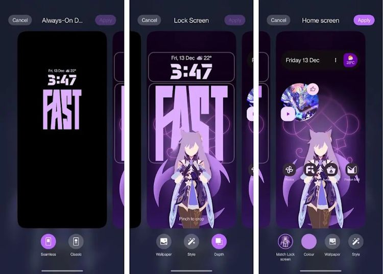
- Blur and Translucency: The “frosted glass” or “Mica” effect, heavily popularized by iOS and Windows, is now a staple in many Android skins. The notification shade, quick settings panel, and app folders often feature a blurred background, adding a sense of depth and helping the user focus on foreground content.
- Simplified Quick Settings and Control Centers: The cluttered toggle grids of the past are being replaced by cleaner, more organized control centers. Large, easy-to-tap sliders for brightness and volume, along with logically grouped connectivity toggles, improve usability and reduce cognitive load.
- Consistency in Iconography and Typography: There is a greater emphasis on a unified visual language. Icons are more uniform in shape and style, and typography is used more deliberately to create a clear visual hierarchy. This contributes to a more polished and professional look.
The Driving Forces Behind the Shift
This convergence isn’t happening in a vacuum. Several factors are pushing manufacturers in this direction:
- Elevated User Expectations: Apple’s iOS has long set a high standard for UI fluidity and design polish. As users become more tech-savvy, they expect a premium, lag-free experience regardless of the platform. For many, “smooth” is synonymous with “quality.” The latest Android News often highlights performance benchmarks and animation smoothness as key differentiators.
- The Pursuit of the “Switcher”: Manufacturers are keenly aware of the large pool of iPhone users. To entice them to switch to an Android phone, the transition needs to be as seamless as possible. Adopting familiar design patterns and interaction models lowers the learning curve and makes Android feel less alien to a potential new customer.
- Hardware and Software Maturity: Modern smartphone processors and high-refresh-rate displays (120Hz and above) can now handle complex animations and rendering effects without compromising performance. This hardware advancement gives designers and engineers the freedom to implement more sophisticated UIs that were previously unfeasible.
Section 3: Implications for the Android Ecosystem
This design convergence has far-reaching consequences for every stakeholder in the Android world, from the end-user to the app developer. While it brings many benefits, it also presents new challenges and trade-offs.
For the Everyday User: A Double-Edged Sword
For the average consumer, this trend is largely positive. Android Phones are now more reliable, intuitive, and aesthetically pleasing than ever before. The focus on core user experience means better performance, improved battery life, and an interface that is generally easier to navigate. The reduced fragmentation between brands also makes it easier to switch from a Samsung device to a OnePlus or Pixel device without having to completely relearn the operating system.
However, there is a downside. The unique quirks and distinct personalities of older Android skins are fading. Users who enjoyed the deep customization and “tinkerer’s spirit” of platforms like CyanogenMod (now LineageOS) or older versions of OxygenOS may feel that the modern landscape is becoming too restrictive and homogenous. The “one size fits all” approach can stifle the very diversity that made many fall in love with Android in the first place.
For Power Users and Developers
Power users, who thrive on customization, face a changing environment. While Android’s core allows for third-party launchers, icon packs, and deep settings tweaks, some manufacturers are making it more difficult to alter the default experience. As OEM launchers become more integrated with system-level features (like gestures and animations), third-party alternatives can sometimes feel less smooth or fully featured.
For developers, the situation is complex. On one hand, the underlying consistency of Material You and similar design principles makes it easier to build apps that look good on a variety of devices. Google’s Jetpack Compose UI toolkit further helps in creating adaptive UIs. On the other hand, the visual divergence of OEM skins still presents a challenge. An app designed with Pixel’s Material You aesthetic in mind might look slightly out of place on Samsung’s One UI, which uses different iconography, spacing, and component styles. Developers must test their apps across a wide range of popular skins to ensure a consistent and high-quality user experience.
Section 4: Navigating the Modern Android Landscape: Recommendations and Best Practices
In this era of refined choice, selecting the right Android experience is more nuanced than ever. It’s less about “stock” vs. “skinned” and more about which manufacturer’s ecosystem and design philosophy best aligns with your needs.
Tips for Choosing Your Android Flavor
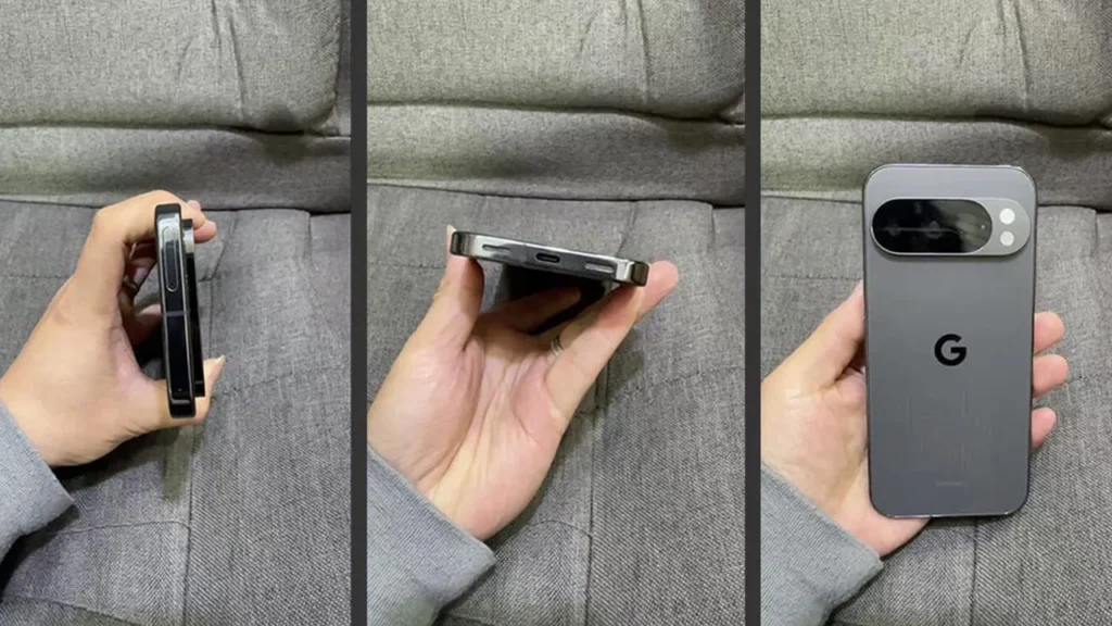
- For the Purist and Early Adopter: Google Pixel. If you want the latest Android features as soon as they are released and prefer Google’s vision for the OS, a Pixel phone is the obvious choice. The experience is clean, intelligent, and deeply integrated with Google’s services.
- For the All-in-One Ecosystem User: Samsung Galaxy. If you want a phone that works seamlessly with a watch, earbuds, tablet, and even a desktop environment (via DeX), Samsung offers the most complete and mature ecosystem in the Android world. One UI is feature-rich and highly polished.
- For the Performance-Focused User: OnePlus. While its software has evolved, OnePlus still places a heavy emphasis on speed and fluidity. Their devices often offer top-tier specifications and a fast, responsive software experience for those who prioritize performance above all else.
- For the Tinkerer: ASUS or Nothing. Brands with lighter skins, like ASUS’s ZenUI or Nothing OS, often provide an experience closer to stock Android while still offering powerful customization options and unique hardware.
Best Practices for Reclaiming Individuality
Even on a heavily skinned phone, you can still make the experience your own. Android’s core strength remains its flexibility.
- Explore Third-Party Launchers: Apps like Nova Launcher, Action Launcher, or Niagara Launcher can completely transform your home screen, app drawer, and gestures, offering customization far beyond what most stock launchers provide.
- Master Widgets: Use apps like KWGT (Kustom Widget Maker) to create completely bespoke widgets for your clock, weather, calendar, and more. This allows you to break free from the default aesthetic.
- Embrace Material You Theming: Many modern apps support Google’s dynamic theming engine, which pulls colors from your wallpaper. By choosing your wallpaper carefully, you can create a more cohesive color palette across your apps, even on non-Pixel phones.
Conclusion: A Mature and Unified Future
The great convergence in the world of Android Phones marks a pivotal moment in the platform’s history. The move away from chaotic fragmentation towards a more unified, polished, and performance-oriented user experience is a clear sign of a maturing market. While some may mourn the loss of the “wild west” era’s unbridled diversity, this evolution has made Android more accessible, reliable, and competitive than ever. The focus has shifted from simply adding more features to perfecting the core experience—a change that benefits the vast majority of users.
Ultimately, the choice within the Android ecosystem is no longer just about hardware specifications; it’s about choosing a software philosophy. Whether you prefer the intelligent simplicity of a Pixel, the comprehensive ecosystem of a Samsung Galaxy, or the raw speed of a OnePlus device, the modern Android landscape offers a refined and powerful experience for everyone. The identity of Android is not being lost; it is being forged anew, defined by a balance of cohesive design and enduring personal choice.