The Evolution of the Android Lock Screen: Is Google Reviving a Classic Media Feature in Android 15?
The lock screen on our Android phones is the first thing we see dozens, if not hundreds, of times a day. It has evolved from a simple security gate into a dynamic, at-a-glance information hub, displaying notifications, the time, and quick access to the camera or assistant. However, for long-time Android enthusiasts, the modern lock screen often feels like a step back in one crucial area: media playback. The immersive, full-screen album art and rich controls of yesteryear have been replaced by a more sterile, standardized notification. This shift has been a point of contention for years, a quiet lament for a feature that many felt perfectly balanced form and function.
Recent developments and whispers in the Android community, however, suggest a change is on the horizon. The latest Android News points towards a potential revival of a more visually engaging lock screen experience in the upcoming Android 15. This isn’t just about nostalgia; it’s about re-evaluating user interface design and acknowledging the powerful connection users have with their content. This article delves into the history of Android’s lock screen media controls, explores the current fragmented landscape across different Android Phones, analyzes the evidence for this rumored comeback, and discusses the implications for users and the wider ecosystem of Android Gadgets.
A Journey Through Time: The Evolution of Android’s Lock Screen Media Experience
To understand the excitement surrounding a potential change in Android 15, we must first look back at the journey of the lock screen itself. Its design philosophy has mirrored the maturation of the Android operating system, shifting from unbridled customization to streamlined consistency, and now, perhaps, to a new synthesis of both.
The Golden Era: Full-Screen Album Art and Widgets (Android 4.x – 5.x)
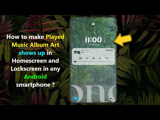
Many users consider the period of Android 4.x (Ice Cream Sandwich, Jelly Bean, KitKat) to be a golden age of personalization. A standout feature was the ability to place widgets directly on the lock screen. This allowed for unparalleled utility, letting you see your calendar, to-do list, or, most importantly, control your music without ever unlocking your device. When music was playing, many apps would take over the entire lock screen, displaying beautiful, full-screen album art. It was an immersive and visually stunning experience. The album art wasn’t just a tiny thumbnail; it was the entire background, blurring beautifully behind the clock and playback controls. This feature transformed the phone from a simple utility into a personal expression of the user’s current mood and taste.
However, this era of deep customization came with its own set of challenges. Lock screen widgets posed a potential security risk, as they could expose sensitive information from apps without authentication. Furthermore, the lack of a standardized design led to a sometimes-inconsistent user experience. With the introduction of Android 5.0 Lollipop and its revolutionary Material Design language, Google began to prioritize a clean, unified, and secure interface. This meant a move away from lock screen widgets and full-screen album art in favor of a more structured system: notifications.
The Shift to Standardization: Media as a Notification (Android 6.x – 10)
From Android 6.0 Marshmallow onwards, media controls were relegated to a standard notification card on the lock screen. While highly functional, this approach sacrificed all of the visual flair of its predecessor. The beautiful, full-screen album art was replaced by a small, constrained thumbnail. The rich, app-specific controls were simplified into a standardized set of play/pause and skip buttons. The primary benefit was consistency. No matter which music or podcast app you used, the controls looked and behaved in a predictable way. This design also integrated seamlessly with the new notification management system, allowing users to handle multiple alerts efficiently.
While a logical step from a system architecture perspective, many users felt this change stripped the lock screen of its personality. The functional, utilitarian approach felt cold compared to the vibrant, expressive experience that had been lost.
![Android lock screen album art - Disable Lock Screen Album Art on Android Lollipop [How-To] - YouTube](https://android-digest.com/wp-content/uploads/2025/12/inline_d87b6fb4.jpg)
The Modern Approach: Media Controls in Quick Settings (Android 11 Onwards)
In Android 11, Google once again redesigned media playback. Controls were moved out of the main notification list and into a dedicated, persistent space within the Quick Settings panel. This was a smart move, preventing a music session from being accidentally dismissed along with other notifications and providing a consistent location for media management. In subsequent versions like Android 12 and 13, Google added a subtle “squiggle” or wave animation to the progress bar, a small nod to the desire for more visual feedback. While a definite improvement in usability, it still lacked the immersive quality of the Lollipop era.
The Tale of Two Androids: Stock vs. OEM Skins
A common point of confusion in any discussion about Android features is the vast difference between devices. The experience on a Google Pixel phone running “stock” Android can be worlds apart from a Samsung Galaxy device. This fragmentation is both Android’s greatest strength and a significant source of user confusion, especially when it comes to features like the lock screen.
Understanding Android’s Open-Source Nature
Google develops the Android Open Source Project (AOSP), which forms the base of the operating system. However, manufacturers like Samsung, OnePlus, and Xiaomi take this base code and build their own custom software layers, or “skins,” on top of it. These skins—such as Samsung’s One UI, OnePlus’s OxygenOS, or Xiaomi’s MIUI—include unique visual designs, custom apps, and, crucially, different feature sets. This is why a feature removed from AOSP by Google might still exist, or be re-implemented, by a manufacturer on their specific line of Android Phones.
Case Study: Samsung’s One UI and the Power of Good Lock
Samsung is a prime example of a manufacturer that offers deep customization far beyond what stock Android provides. While Google was simplifying the lock screen, Samsung was building tools to empower users to personalize it. The most powerful of these is the Good Lock app suite, a collection of modules that allow for granular control over the One UI experience.
Using the “LockStar” module within Good Lock, a Samsung Galaxy user can:
- Completely change the layout of the lock screen, moving the clock, notifications, and media player.
- Choose from various media player widget styles, some of which are much larger and more visually prominent than the stock Android version.
- Customize every element, from the clock font to the shortcut icons.
This is why a Galaxy phone owner might be perplexed by discussions of a “missing” feature; on their device, a highly customizable and visually rich media player on the lock screen has been an option for years. It highlights that the “Android experience” is not monolithic. The capabilities of your device are often defined as much by its manufacturer as they are by Google.
Android News Spotlight: Resurrecting a Classic in Android 15
The latest buzz in the Android world, fueled by code analysis and early developer previews, suggests that Google is finally ready to bring a richer experience back to the stock Android lock screen. This isn’t just about bringing back an old feature; it’s about reimagining it for the modern OS.
Decoding the Clues: Evidence from AOSP and Developer Previews
Tech journalists and developers often scour the AOSP code repositories and dive deep into early beta builds to find clues about future features. Recent findings point to the development of a new “communal space” or widget-like area for the lock screen in Android 15. While the full scope is not yet clear, one of the primary use cases being tested appears to be a revamped media player. Code changes suggest a system that would allow for a much larger, more interactive, and visually appealing media controller. This could be the spiritual successor to the full-screen album art feature, designed with the security and consistency principles of modern Android in mind.
A Potential Technical Implementation
So, how might this work? It’s unlikely to be a free-for-all widget system like in the KitKat days. A more probable approach would be a dedicated, system-managed space on the lock screen where select apps can display rich content. For media, this could mean that when music is playing, the default minimalist notification is replaced by a larger panel containing:
- Larger album art.
- A more prominent progress bar, perhaps with the return of a more advanced visualizer.
- Additional controls like shuffle, repeat, or even access to the current playlist.
For this to work, Google would need to create new APIs for developers. Media app developers would then need to update their applications to support this new display format, providing the necessary assets and metadata to populate the enhanced lock screen view. The main challenge for Google’s engineers will be to implement this in a way that is battery-efficient and doesn’t compromise the security of the lock screen.
Preparing for the Future: Tips and Best Practices for Android Users
Whether this new feature materializes and how it’s implemented will have a direct impact on the daily experience of millions of users. Depending on the type of Android phone you own, your course of action and expectations should differ.
For Users of Stock Android Phones (e.g., Google Pixel)
If you own a Pixel or a device running a near-stock version of Android, this potential change in Android 15 is big news. You stand to gain a major new customization feature that you currently lack.
- Stay Informed: Keep an eye on reputable Android News outlets as the Android 15 beta program progresses through the summer.
- Consider the Beta: If you’re an enthusiast, consider enrolling your device in the Android Beta Program when it becomes available to test these new features firsthand.
- Prepare for Customization: If the feature is implemented, expect to find new options in your device’s “Display” or “Lock Screen” settings to enable and configure it.
For Users of OEM-Skinned Android Phones (e.g., Samsung, OnePlus)
If you use a device with a heavy OEM skin, the path is less clear. Your manufacturer already has its own custom lock screen solution.
- Explore Existing Options: Before Android 15 even arrives, dive into your phone’s settings. You might be surprised by the level of customization already available, especially if you have a Samsung device with Good Lock.
- Wait and See: The manufacturer will decide how to integrate Google’s new AOSP feature. They might adopt it as is, ignore it in favor of their own solution, or blend the two. This will likely be announced when they reveal their version of the Android 15 update (e.g., One UI 7.0).
Practical Considerations for All
Regardless of your device, a more dynamic lock screen brings universal considerations. More complex visuals and widgets can have a minor impact on battery life, particularly on devices with OLED screens. Furthermore, be mindful of privacy. A lock screen that displays more information from your apps could potentially expose personal data to anyone who glances at your phone.
Conclusion: A Welcome Return to Form
The potential return of a more visually rich and immersive media experience to the Android lock screen is more than just a welcome piece of Android News; it’s a reflection of a maturing design philosophy at Google. After years of prioritizing standardization and minimalism—often at the expense of personality—it appears the pendulum is swinging back towards a more balanced approach that values both function and expressive design. This rumored feature in Android 15 could finally bridge the gap between the beloved immersive controls of the past and the secure, consistent framework of modern Android.
For users of all types of Android Phones and Android Gadgets, this signals a positive trend. It acknowledges that our devices are deeply personal, and the experience of interacting with our favorite content should be enjoyable and engaging, starting from the very first screen we see. The lock screen’s evolution continues, and its next chapter may just be its most exciting one yet.