The Evolution of Android Navigation: Why a Simple Button Swap Signals a Major Shift
The Unseen Pillar of User Experience: Deconstructing Android Navigation
In the bustling world of Android phones, innovation is often measured by flashy hardware specifications—brighter displays, faster processors, and more complex camera systems. We celebrate new foldable designs and marvel at ever-increasing charging speeds. Yet, beneath these headline-grabbing features lies a fundamental element of our daily interaction that is arguably more impactful: the navigation system. How we move between apps, go back a screen, or return to our digital home is the invisible thread connecting every action we take. For years, this core experience has been a quiet battleground of philosophies, pitting Google’s vision of a “pure” Android against the user-centric customizations offered by manufacturers like Samsung.
Recently, a subtle but significant piece of Android news emerged: Google’s Pixel phones, the standard-bearers for pure Android, are gaining the ability to swap the order of their on-screen navigation buttons. This feature, a long-standing staple for users of Samsung and other Android gadgets, might seem trivial to the uninitiated. However, it represents a profound shift in Google’s approach, signaling a move from a prescriptive design philosophy to one that more fully embraces the platform’s greatest strength—unparalleled user choice. This article delves into the evolution of Android navigation, exploring its history, the rise of gestures, and why this small change has major implications for the future of the entire ecosystem.
Section 1: A Journey Through Time: The History of Android Navigation
To understand the significance of today’s navigation systems, we must first look back at their origins. The way we navigate our Android phones has undergone several radical transformations, each reflecting the technological and design priorities of its era.
The Early Days: Physical Buttons and the Four-Key Layout
The first generation of Android devices relied on physical, tactile buttons. Before the sleek, all-screen devices we know today, phones like the T-Mobile G1 and the HTC Hero featured a distinct row of keys typically comprising four functions: Home, Menu, Back, and Search. The ‘Menu’ button was particularly crucial, as it revealed context-sensitive options within applications. The dedicated ‘Search’ key highlighted Google’s core business and its vision for a deeply integrated search experience on mobile. This physical approach provided clear, unambiguous feedback but came at the cost of design flexibility and screen real estate.
The On-Screen Revolution: Ice Cream Sandwich and the Three-Button Standard
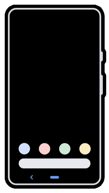
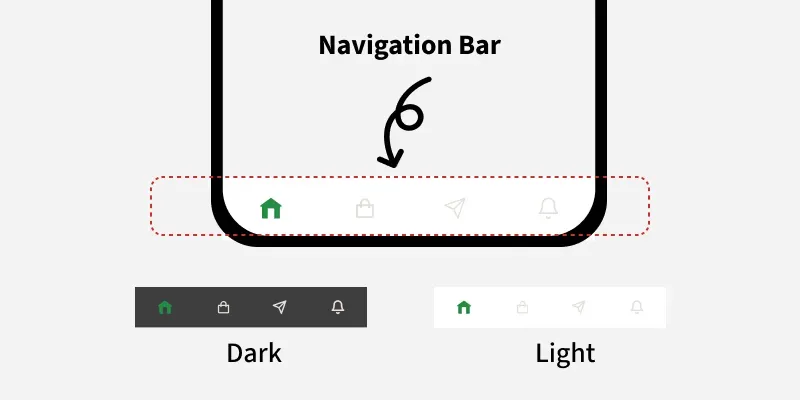
The release of Android 4.0 Ice Cream Sandwich in 2011 marked a pivotal moment. Google introduced on-screen, virtual navigation buttons, forever changing the face of Android phones. This move allowed for more dynamic and adaptable interfaces, enabling the buttons to hide during full-screen media playback or change orientation. With this shift, the layout was standardized to a three-button system: Back, Home, and a new ‘Recents’ or ‘Overview’ button that replaced the Menu key. The Menu function was absorbed into application interfaces, often represented by the now-ubiquitous “three-dot” icon.
The Great Divide: The Back Button Debate
While Google established the Back-Home-Recents order as its standard, a significant divergence emerged. Manufacturers like Samsung, who quickly became the dominant force in the Android market, opted for a different arrangement: Recents-Home-Back. Their rationale was rooted in ergonomics. With phone screens growing larger, placing the ‘Back’ button—arguably the most frequently used navigation key—on the right side made it easier for the majority of right-handed users to reach with their thumb. This seemingly minor difference became a defining characteristic of different Android “skins” like Samsung’s One UI versus Google’s stock experience. For years, users switching between brands faced a frustrating period of muscle memory readjustment, a small but persistent friction point within the ecosystem.
Android navigation bar on phone screen – BottomNavigationView in Android – GeeksforGeeks
Section 2: The Gesture Uprising: A New Paradigm for Interaction
As smartphone designs pushed towards bezel-less, all-screen fronts, the on-screen navigation bar began to look like wasted space. This design trend, coupled with Apple’s introduction of gesture navigation on the iPhone X, prompted a fundamental rethinking of how users should interact with their devices. Android was poised for its next great navigational leap.
Google’s Push for a Buttonless Future
With Android 9 Pie, Google introduced its first mainstream attempt at gesture navigation. It was a hybrid system that replaced the three-button array with a small “pill” for the Home function and a contextual Back button. A swipe up on the pill revealed the Recents screen. While functional, it was widely seen as a transitional step. The true revolution arrived with Android 10, which introduced a fully gestural system. A swipe up from the bottom took you Home, a swipe up and hold opened Recents, and a swipe in from the left or right edge acted as the Back command. The primary goal was clear: to maximize usable screen space and create a more fluid, modern user experience.
The Technical Challenges and User Friction
The transition was not without its problems. The most significant issue arose from the new Back gesture. For years, Android apps had used a swipe-in-from-the-left-edge gesture to open navigation drawers or “hamburger menus.” Google’s new system created a direct conflict. To solve this, developers had to update their apps, and Google introduced a “back sensitivity” setting, allowing users to define how far from the edge the gesture would trigger. This gave users more control but also added a layer of complexity. Many long-time users found the gestures less precise and slower than a simple tap of a button, leading to a significant portion of the user base choosing to stick with the classic three-button layout, which Google wisely kept as an option.
How OEMs Adapted and Innovated
While Google pushed its standardized gesture system, other makers of Android gadgets took their own paths. Samsung, for instance, offered Google’s gestures but also provided its own alternative, which involved swiping up from the bottom of the screen in the locations where the three buttons used to be. This offered the screen real estate benefits of gestures while retaining the spatial muscle memory of the button layout. Companies like OnePlus also offered their own unique gesture implementations before eventually converging towards Google’s standard. This period highlighted the fragmented yet innovative nature of the Android ecosystem, where different solutions competed for user preference.
Section 3: The Full Circle: Google’s Embrace of Customization
The Android news that Pixel phones would finally allow users to reverse the order of the navigation buttons marks a significant turning point. It’s an admission that a one-size-fits-all approach, even for its own hardware, may not be the best path forward. This change reflects a deeper philosophical shift within the Android development team.
A Nod to the Ecosystem: Learning from a Competitor
Android navigation bar on phone screen – Bottom Navigation Bar in Android Jetpack Compose – GeeksforGeeks
For over a decade, the ability to swap navigation buttons has been a staple feature on Samsung Galaxy phones and devices from many other manufacturers. By finally incorporating this option into the “pure” Pixel experience, Google is acknowledging the validity of a design choice it long resisted. This isn’t just about adding a feature; it’s about reducing the friction for a massive user base accustomed to Samsung’s layout. Someone considering a switch from a Galaxy S-series phone to a Pixel phone no longer has to worry about retraining years of muscle memory, removing a small but psychologically important barrier to entry.
From Prescription to Personalization: A Maturing Philosophy
Historically, Google’s Pixel line has served as a showcase for its singular vision of Android. It was clean, minimalist, and, some would argue, occasionally rigid. Features were presented as the “correct” way to do things. This new flexibility suggests a maturing philosophy. Instead of dictating the single best user experience, Google is moving towards providing a powerful, stable foundation upon which users can build their own ideal experience. It recognizes that what works for one person may not work for another, and that true user-friendliness comes from adaptability. This aligns more closely with Android’s original promise of openness and choice, a core differentiator from its main competitor, Apple’s iOS.
Implications for the Future of Android Phones
This change could be a harbinger of things to come. We may see the Pixel UI, once a bastion of minimalism, begin to selectively adopt more of the popular “power user” features found in skins like One UI. This could lead to a more feature-rich and competitive Pixel experience out of the box. For the broader ecosystem, it signals that Google is paying closer attention to the innovations happening outside of its own walls. This cross-pollination of ideas, where the best features from OEM skins can influence the core of Android and vice-versa, ultimately benefits all users, regardless of which brand of Android phone they choose.
Section 4: Navigating Your Choices: Recommendations and Best Practices
Android navigation bar on phone screen – Android application package Application software Mobile app Lock …
With multiple navigation options available on modern Android phones, choosing the right one can enhance your daily efficiency and enjoyment. Here’s a breakdown to help you decide what’s best for you.
Practical Comparison: Gestures vs. 3-Button Navigation
- Gesture Navigation:
- Pros: Maximizes screen real estate for an immersive experience; feels modern and fluid once mastered; allows for quick back actions from either side of the screen.
- Cons: Can have a steep learning curve; may conflict with certain app gestures (e.g., side menus); can be less precise than a button tap, especially for users with motor difficulties.
- 3-Button Navigation:
- Pros: Extremely familiar and intuitive for long-time users; provides precise, one-tap actions with no ambiguity; avoids any conflict with in-app gestures.
- Cons: The navigation bar permanently occupies a portion of the bottom of the screen; can feel dated compared to modern gesture systems.
Actionable Tips for Customization
Regardless of your choice, you can fine-tune the experience to your liking:
- Find the Setting: On most Android phones, navigation options are found under
Settings > System > Navigation modeor a similar path underDisplaysettings. - Adjust Gesture Sensitivity: If you choose gestures, dive into their settings to adjust the back gesture sensitivity. Increasing it makes the gesture easier to trigger, while decreasing it helps prevent accidental activations when trying to interact with elements near the screen edge.
- Swap Button Order: If you use the 3-button layout on a supporting device (now including Pixels), look for an “Invert buttons” or “Button order” toggle within the navigation settings to match your preference.
- Explore Third-Party Launchers: For ultimate control, apps like Nova Launcher or Action Launcher can offer even deeper customization, including custom actions for button presses or more advanced gesture controls.
Conclusion: The Enduring Power of Choice
The journey of Android navigation—from physical keys to virtual buttons, and from rigid layouts to fluid gestures—is a microcosm of the platform’s own evolution. What began as a functional necessity has transformed into a sophisticated system that reflects a core philosophical debate about simplicity versus customization. The recent decision by Google to allow Pixel users to swap their navigation buttons is far more than a minor software update. It is a powerful statement that acknowledges the diverse needs of its users and the valuable innovations born from its hardware partners.
This move signals a mature, confident Android that is no longer afraid to learn from its ecosystem. It reaffirms that the platform’s greatest asset has always been its flexibility. Whether you prefer the classic precision of buttons or the immersive flow of gestures, the power to choose is what makes the world of Android phones so compelling. As the operating system continues to evolve, this commitment to personalization ensures that our devices will only become more intuitive, more efficient, and more uniquely our own.